
Figure 1: Automatic Presentation System Architecture
An automatic presentation system is an intelligent interface component
which receives information from a user or application program
and designs a combination of graphics and text that effectively
conveys it. It is a facility that assumes the presentation responsibilities
for other programs. An important research question has been how
information should be specified or described by an application
program for it to be presented by an automatic presenter. This
paper proposes a taxonomy of information characteristics
which would need to be provided to either human or computer designers
for them to create presentations reflecting the individual needs
of a diverse group of users. The proposed taxonomy of characteristics
defines the representational goals for intelligent interfaces
which reason about graphical displays.
The goal of an automatic presentation system would be to eliminate the need for end-users and application programmers to specify, design and arrange a display each time output is needed from a program. Instead, users would focus their attention more appropriately on the tasks of determining and describing the informational content to be presented in a display.
An important research problem for those interested in developing automatic presentation systems has been how it would interact and communicate with application programs. Specifically, what kinds of information about a user's data must be communicated to a system for it to design an effective presentation?
Figure 1 illustrates this question with an architectural description of a system called SAGE, which automatically designs both graphical and textual presentations [9]. The architecture is similar in philosophy to several other intelligent systems (e.g. [4, 6, 7] in which an application program must provide information to a presentation system. For simplicity, the figure refers only to graphics presentation.
The application program in this architecture might be a query interface to a database system or any program that retrieves information within a spreadsheet, accounting, inventory, scheduling, project management or statistical package. Applications must communicate presentation needs in the form of particular database facts to the graphics system. The latter applies its design knowledge to select and synthesize appropriate graphical techniques to best convey the facts. Design knowledge must not be application-specific and therefore cannot depend on recognizing specific database relations or data sets contained in the presentation needs. Design knowledge must be expressed in terms of more general characterizations of information.
To preserve this generality, each application must provide a data
characterization, which is a description of the semantic and
structural properties of its information that are relevant to
presentation design. Some of these characteristics are easily
understood and communicated by human graphics designers. Others
are often neglected and lead to inappropriate displays. In either
case, it is necessary to define and represent explicitly all relevant
characteristics of data for a computer system to make appropriate
presentation decisions. The goal of this paper is to outline a
taxonomy of characteristics which must be communicated to either
human or computer designers for them to create effective presentations
in an application independent fashion.
The set of characteristics we propose has been used to design presentations with SAGE, a system for automatic and graphical explanation [9]. They also are generalizations of a smaller, less complete set of data characteristics implicit in other work in this area by [6] on APT, an automatic presentation tool. SAGE and APT are both concerned with presenting relational data using numerous variations and syntheses of 2-D static displays found in business and statistical graphics packages (e.g. bar and plot charts, node-link graphs, gauges, techniques using shape, color or size, tables).
The types of information with which these systems are concerned are the relations among data values contained in relational database or frame-based representations. For example, an entry from SAGE's testbed (a frame-based project management database) might specify a project activity, build-roof, a time-quantity, 12 days, and a duration relationship between the two values. The duration relation maps between a set of activities and a set of time-quantities.
Similarly, SAGE's test-bed contained other information about a company's activities, resources, products, and departments and their costs, dates, durations, precedence, and part-whole relations. Information was expressed as object-attribute-value tuples (e.g. design-activity cost $3000), where objects and values correspond to set elements and attributes correspond to relations. Frames and relation-tuples among sets are equivalent informationally, but in this paper we will use the set and relational terminology.
There were several criteria by which we judged the relevance of different data characteristics. First, we included characteristics which were necessary for distinguishing the kinds of information that each graphical technique could express. We also included data characteristics which helped order graphical techniques based on how effective they were at conveying different information (following the [6] distinction between expressiveness and effectiveness). Third, we included characteristics which could be used to determine how information could be integrated within a display. Finally, characteristics were needed which could be applied easily by users.
Each of the following sub-sections describes a dimension along
which data can be characterized to support presentation design.
In addition, we describe several examples of graphical decisions
which depend on each dimension and which motivated its inclusion.
The building-blocks of a graphical presentation are the techniques for identifying a single element from a set of possible values. For example, the horizontal position technique uses a marker's X-location to identify a single value from among those listed on the graph's X-axis. Retinal techniques [2] use a marker's size, shape, or color to identify a value from a set described in a corresponding key. Textual techniques identify an element by displaying a sequence of letters and numbers which are usually its name. Several characteristics of a set are relevant to choosing an appropriate graphical technique.
The nature of the ordering relationship among a data set's elements was the predominant criteria used in APT and one criteria in SAGE for choosing graphical techniques. An ordering technique can be characterized as either quantitative, ordinal, or nominal.
In quantitative sets, the elements are ordered numerically (e.g., the set of dollar amounts ranging from $0.01 to $50.00. Knowing that a data-set is quantitative tells a system that the elements can be conveyed effectively by a graphical technique with a quantitatively varying visual dimension, such as position along an axis, angles in a pie chart, the areas of circles, or the brightness of gray-scale levels. Users can easily transform these quantitative perceptual properties to the values of corresponding data-set elements. In contrast, a technique which expresses elements of a set with different shapes (e.g. star, circle, square, triangle) cannot express quantitative data because perceptual differences amongs shapes cannot be easily transformed to quantities.
In ordinal sets, element ordering is peculiar to the semantics of the set, as in performance-ratings: {poor, fair, good, excellent}. In contrast to quantitative sets, presentations of ordinal sets require techniques which can enumerate explicitly every element along an axis or key (since intermediate values cannot be interpolated).
In nominal sets, elements are unordered (e.g., the set of computer-brands). These can be expressed effectively using colors or shapes, which don't vary quantitatively, providing the set size is small. In contrast to quantitative sets, nominals may be misperceived as ordered if techniques are used which employ a quantitative dimension to convey elements (e.g. bar-charts, circle-size).
In order to capture some subtle distinctions relevant to SAGE's project management database, it was necessary to go beyond the Set-Ordering characteristic which was the predominant property used in APT. In particular, it was necessary to recognize that elements of ordered sets are coordinates if each element specifies a point or location temporally, spatially, or otherwise (e.g. calendar-date, latitude, time-zone, congressional-district). In contrast, amounts are not embedded in particular frames of reference (e.g. number of days, dollar-amounts, weight).
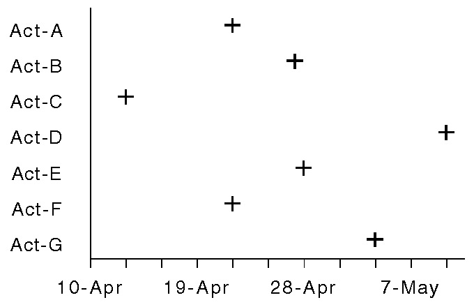
To understand the usefulness of this distinction, consider the graphs in Figure 2 and Figure 3, which express the start-dates of activities. The bar-chart is awkward because it suggests that amounts of time are being expressed. The plot-chart is superior, since it reinforces the idea that start-dates are coordinates in time. Other techniques (e.g. gauges, grey-scale) are likewise inappropriate for coordinates.

SAGE's
characterization went beyond APT's by recognizing that sets can
belong to the different domains of time, space,
temperature, or mass. This information helps to
preserve subtle stylistic conventions, such as using a horizontal
axis for time coordinates and a vertical axis for temperature.
This characterization can also be helpful for judging how to group
and integrate relations within pictures (e.g. displays of dates
and durations for activities might be grouped separately
from data unrelated to time).
The second dimension along which information was characterized describes the way relations map from elements of one set to another. Mackinlay distinguished relations having functional dependency as those for which each element of a domain maps to only one value in another domain. For example, the cost relation is a functional dependency, mapping from each activity in a set to exactly one dollar amount. In contrast, the has-part relation is not a functional dependency, since it maps from each organizational group to a variable number of sub-groups (or none at all). The functional dependency distinction helped determine the appropriateness of different techniques (e.g. networks do not require functional dependency, while bar charts do).
We refined and extended this distinction to handle a number of questions regarding the appropriateness of data - picture combinations not handled in APT. We defined three properties which describe the way relations map from elements of one set to another: Coverage, Cardinality and Uniqueness.
This characteristic conveys whether every element of a set can be mapped to at least one element of another. Recall that a relation like start-date maps from a set of activities to a set of calendar-dates. If the start-date relation has coverage, then every activity has a calendar-date.
We distinguish several types of Non-coverage, which occur when
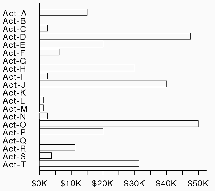
One example of the relevance of this distinction for graphical design is the fact that bar- and plot-charts do not express relations to quantitative sets effectively when there is non-coverage. The reason for this is that there is no way to express the absence of data without adding a special mark or leaving a blank space instead of a bar, either of which can be misperceived as low values (i.e. short bars). Figure 4 illustrates the potential misperception caused by missing values, when for example, a user needs to find the 3 or 4 activities with the smallest labor-costs. Placing an asterisk in the space still leaves this problem and also adds clutter.
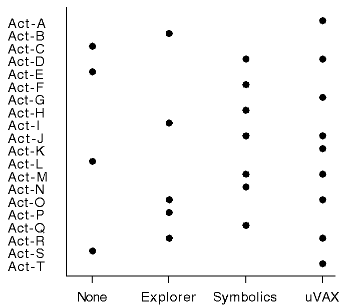
In contrast, plot-charts have fewer problems with non-coverage with nominal sets because missing values can be explicitly marked on the unordered axis, as in Figure 5.
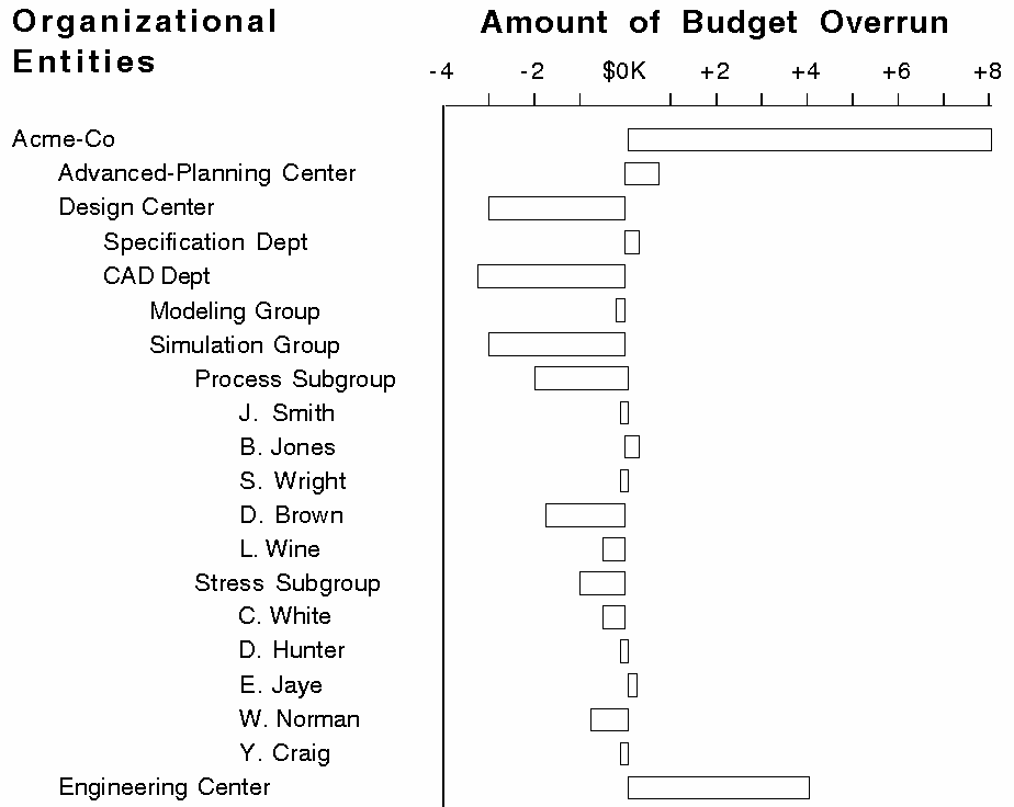
Node-link diagrams (trees or directed graphs) effectively convey relations involving no-values with the absence of a link from a node. For example, the organizational-entities which are the leaves of the tree in Figure 6 have no parts. In other words, the has-part relation does not show coverage for some of the organizational-entities. While node-link techniques are expressive for no-values, they are ineffective when non-coverage is due to missing data. The absence of a link below a node always implies there is no relation between the element represented by the node and other elements.

This characteristic expresses the number of elements of a set to which a relation can map from an element of another set. In frame terminology, it expresses the number of values that can occur for an attribute of an object: single-valued, fixed-multiple-valued, variably-valued. Examples are activity start-date (single-valued), quality ratings by three inspectors for a set of product parts (fixed-multiple values), and organizational parts for groups in a company (variably-valued). Cardinality should not be confused with the concept of arity [10], which refers to the number of different domains in a relation, where each domain (value) plays a different role.
As with coverage, the quality of displays using different techniques is influenced by cardinality. For example, as Figure 6 indicates, node-link diagrams express variably-valued and fixed-multiple-valued relations adequately. The has-part relation maps from one organization-entity to a variable number of others. Node-link techniques can also express single-values, but these result in a chain of nodes, which conveys little information. This problem is even greater for an indentation technique (Figure 7), which expresses multiple-values well but would be ineffective for some single-valued relations.

Bar-charts are also affected by cardinality and are confusing for variably-valued relations which map to a quantitative data set. Consider a relation called available-baud-rates mapping modem-models to rates (110,300,1200,2400,3600), where Brand-X has 3 adjustable rates (300,1200,2400) and Brand-Y has only one rate (1200). Displaying variably-valued attributes in a bar chart would be unconventional and potentially confusing because multiple bars are typically used to express two or more different relations consistently for each object. In contrast, plot-charts express variably-valued relations effectively. For example, notice that some activities in Figure 5 require several computers.
Finally, gauges and retinal techniques like color or circle-area are restricted to single-valued relations because of the difficulty of associating more than one graphical object with each label.
This characteristic refers to whether a relation maps to a unique value(s) for each element of a set. The start-date relation is non-unique because two activities can have the same date. The has-part relation (Figure 6) maps uniquely since each organizational-entity has a set of unique parts (i.e. nodes in the tree have only one parent).
Graphical techniques are differentially sensitive to the characteristic
of uniqueness. Bar- and plot-charts are uninfluenced by this characteristic.
Indentation techniques (Figure 7) require
uniqueness because each node must have one parent. Repeating a
node in different places in the display can lead to extreme duplication
and confusion. In contrast, node-link diagrams can express relations
which map non-uniquely with multiple links to a node (e.g. directed
graphs).
While previous examples all involve simple, binary relations, some applications may have relations which map to multiple values, each playing a different role. For example, the geographic-location relation maps between cities and two coordinate values: latitude and longitude. The period-of-employment relation maps between employees and two years: first-year and last-year.
A first attempt to handle these complex relations (i.e. relations of arity > 2) was suggested by [6], but was based strictly on syntactic transformations. For example, it is possible to transform the period-of-employment relation into two simple relations, first-year-employment and last-year-employment which both map between employees and years. One can then design displays treating them as independent relations and ignoring the relationship between them. However, to design a presentation which integrates the relations appropriately requires a presentation system to have more knowledge of the semantics of data than provided in APT.
For example, Figure 8 illustrates a graphical style for displaying time intervals, which would require an automatic designer to understand the relationship among three relations for activities: start-date, end-date and duration. Using this graphical style requires understanding that these relations involve end-points of intervals.

A similar understanding is necessary for displaying the period-of-employment relation. Intervals are important in other domains as well (e.g. the high, low and closing quotes for daily stock-market prices; minimum, maximum and mean for statistical ranges; mean and error ranges for measurement data). A system which does not understand these interval relationships is likely to generate the fragmented displays in Figure 9 rather than the more effective display of Figure 8.
Our approach to this problem is to develop a set of complex data-types which define roles to characterize the relationships among simple binary relations or arguments of complex (N-ary) relations in databases. The set of available data-types has been motivated by the common relationships found in various domains, as well as the existence of popular graphical styles for presenting them. Examples include intervals, statistical abstractions (Mean, Standard Deviation), and 2-D coordinate-locations.


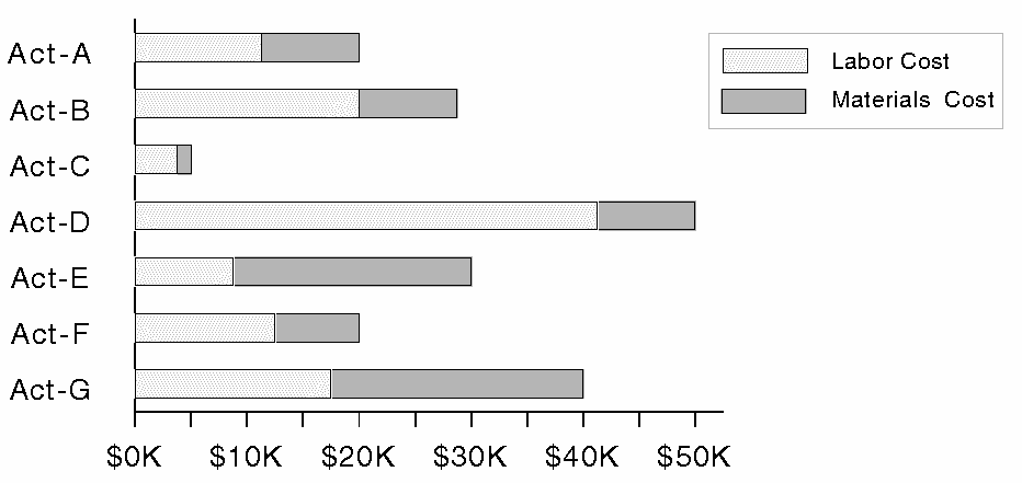
Algebraic dependencies among database elements suggest another dimension which can affect presentation design. Dependencies can occur among attributes (relations) or among values within data sets. For example, an organizational database may contain three relations mapping departments to dollar-amounts: materials-costs, labor-costs, and total-costs, where total-costs = materials-costs + labor-costs. Armed with this information, a designer can integrate the presentation, as in Figure 10. These dependencies can be characterized by representing the underlying semantics, noting that Total-costs is aggregational of the others, or with algebraic equations. Some representation is necessary if a system is to automatically generate this picture rather than depend exclusively on a user's request to do so, as was the case in APT.
Algebraic dependencies can also involve the elements of a single data-set and relation. Figure 11 shows an inappropriate synthesis of pictures of two relations relevant to organizational-entities: the has-part relation and the budget-overrun relation, the latter mapping to the amount by which expenses were under- or overestimated. The display is inappropriate because the value for each organizational-entity is actually the sum of the values of its parts. As a result, it is difficult to compare values for entities at the same level in the organization. In general, charts do not express dependencies and can be confusing when dependencies exist.
These dependencies are common in the databases used for SAGE's
testbed. They can be captured by enumerating the equations among
elements of a database (as would be the case for variables in
a spreadsheet), or by expressing the fact that the has-part
relation aggregates budget-overrun (and perhaps many other
relations involving organizational-entities).
Most of the data and graphical styles with which we are concerned involve the representation of binary or N-ary relations, i.e. relations which map from one domain to one or several other domains. These relations may be thought of as expressing a value for an attribute for each element of a domain (e.g. the duration relation attributes a time-quantity to each activity). There are cases, however, in which a relation serves simply to distinguish a subset of entities. Relations like these express a single property possessed by some elements of a set but not others. In relational terms, these can be considered unary relations: those with arity equal to one (arity referring to the number of domains or arguments in a relation) [10].
For example, the significant relation distinguishes variables from a set passing some statistical test. The critical relation distinguishes risky project activities. It is possible to represent these as binary relations by constructing a second domain for each with two elements. For example, one could convert the significant relation to the significance relation, the latter mapping from a set of variables to a set of statistical-evaluations: {significant, insignificant}. Similarly, frame-based representations force unary relations into a binary form by creating attributes like critical whose values are {true, false}. However, treating unary relations as binary, regardless of how the implementation expresses them, does not capture a user's intent of distinguishing members of a set, as opposed to expressing alternative values. This distinction was necessary for SAGE to select appropriate graphical techniques.
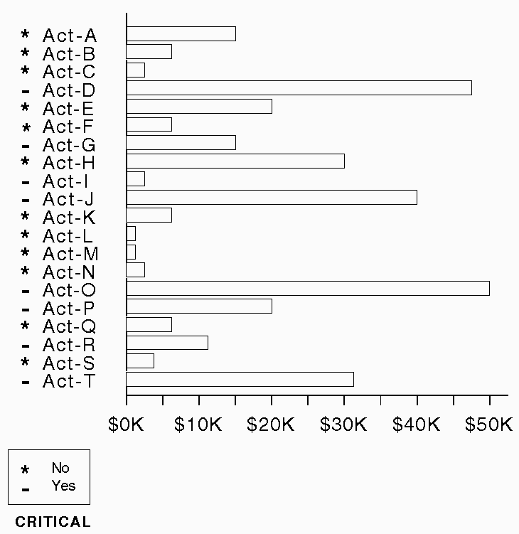
Figure 12 is an example of an appropriate technique for expressing the critical unary relation for elements represented along the vertical axis of another graph. Using an adjacent shape is just one technique for highlighting some members of a set. Other techniques in SAGE's library include darkening the background of a string, italicizing or making its font bold, or outlining it.

Figure 13 shows a technique which inappropriately expresses the critical relation as binary. The cluttered, redundant marks prevent rapid identification of the critical subset. Also, because the application does not give any indication of the different salience of non-critical and critical, the symbols (* -) are arbitrarily assigned to (No Yes). It is clear that explicit characterization of the relation as unary is needed, so that a system can choose a graphical technique that distinguishes set elements rather than expresses binary relations.
Thus far, we have discussed static database characteristics. A presentation system must also consider other properties of data which are specified dynamically either by an application program or an end-user when presentations are requested.
One of the most important issues for graphical design not addressed in APT is the role of an application's or user's goals in viewing data. Differences in goals can greatly alter the effectiveness of graphical techniques or their combinations. Several domain-independent information-seeking goals became apparent in our observations of typical graphical display variations and analytic tasks in the project management domain. They can roughly be distinguished as referring to the function of the data presentation and the distribution of the data within the presentation.
Display function can vary for each relation or object set to be displayed. Presentations vary depending on whether goals emphasize:
Finally, a user's immediate goals may determine the relatedness of different relations and thereby affect how they should be integrated in the presentation. For example, deciding how to group start-date, labor-cost, end-date, and materials-cost depends not only on the types of data, but also on the user's immediate view of which are related. Our approach is for applications to supply optional relatedness information by segmenting the total presentation request into sub-requests which group information by relation or data-set.
[9] has used this technique to coordinate text and graphics displays by converting a topic outline prepared by a discourse processor into a serial list of sub-requests. This indicates to the graphics system that information expressed in contiguous portions of the text should be considered more related, and therefore displayed together. As a result, the serial structure of information in the text corresponds well to the spatial integration of that information across several displays.
More generally, this characteristic provides a vehicle for expressing
two, often competing, informational goals: the need to express
as much information as possible and the need for selected partitions
of sets or relations to be easily and cohesively viewed. A graphics
system needs a characterization of the user's informational goals
to determine how to distribute information across several displays.
The goal of this paper was to present several dimensions along which information can be characterized to support automatic presentation. The dimensions of Data Types, Relational-structure, Arity and Relationships among Relations are static and can be supplied by database creators or application programmers in advance. This is a plausible scenario for large systems with many long-term users. Other dimensions reflect a user's immediate information-seeking goals, including the functional goal of the display and the relatedness of different information subsets.
We have attempted to describe the rationale for these characteristics in terms of common presentation decisions. The strongest motivation was to improve the quality of displays generated by automatic presentation systems. Ultimately, the validity of this taxonomy will depend on its impact on presentation quality. This work must also be integrated with other research tasks described in recent papers [1, 3, 4, 5, 6, 8, 9], including:
This research is supported by Digital Equipment Corporation. The
views and conclusions contained in this document are those of
the authors, and should not be interpreted as representing the
official policies, either expressed or implied, of Digital Equipment
Corporation.
1. Arens, Y., Miller, L., and Sondheimer, N. Presentation Planning Using an Integrated Knowledge Base. In Architectures for Intelligent Interfaces: Elements and Prototypes, Sullivan, J. and Tyler, S., Ed., Addison-Wesley, Reading, Mass, 1990.
2. Bertin, Jacques. Semiology of Graphics. The University of Wisconsin Press, 1983.
3. Feiner, S. An Architecture for Knowledge-Based Graphical Interfaces. In Architectures for Intelligent Interfaces: Elements and Prototypes, Sullivan, J. and Tyler, S., Ed., Addison-Wesley, Reading, Mass, 1990.
5. Kosslyn, S.M. "Graphics and Human Information Processing - A Review of Five Books". Journal of the American Statistical Association 80, 391 (September 1985), 499-512.
6. Mackinlay, J.D. "Automating the Design of Graphical Presentations of Relational Information". ACM Transactions on Graphics 5, 2 (April 1986), 110-141.
7. McKeown, K.R. "Discourse Strategies for Generating Natural-Language Text". Artificial Intelligence 27 (1985), 1-41.
8. Neal, J. and Shapiro, S. Intelligent Multi-Media Interface Technology. In Architectures for Intelligent Interfaces: Elements and Prototypes, Sullivan, J. and Tyler, S., Ed., Addison-Wesley, Reading, Mass, 1990.
9. Roth, S.F., Mattis, J.A., and Mesnard, X.A. Graphics and Natural Language as Components of Automatic Explanation. In Architectures for Intelligent Interfaces: Elements and Prototypes, Sullivan, J. and Tyler, S., Ed., Addison-Wesley, Reading, Mass, 1990.
10. Ullman, Jeffrey. Principles of Database
Systems. Computer Science Press, 1982.
This paper is also available in StuffIt compressed Postcript
and gzip compressed Postscript
formats